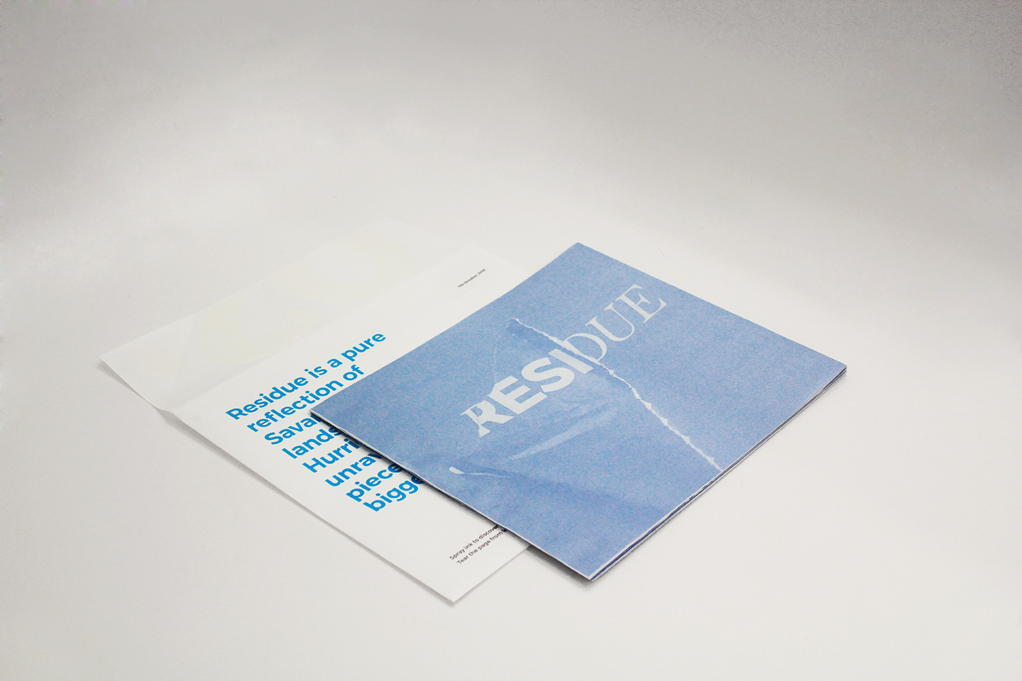
Residue
Book Design
2018
Book Design
2018
Winner of Adobe Design Achievement Awards 2018
Category - Print/Graphic Design 2018
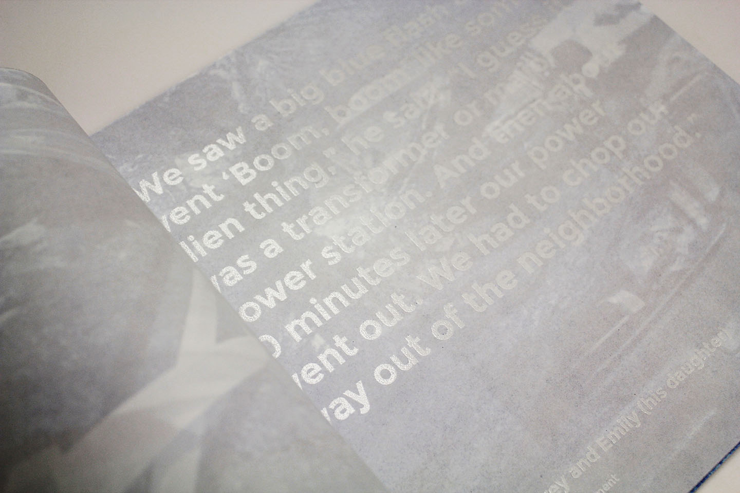
On October 7th, 2016, Savannah witnessed one of the deadliest natural disasters of its time – Hurricane Matthew. Residue is a project based on the reflections and aftermath of what Hurricane Matthew did to the city. The project highlights the destruction caused that night as an attempt to evoke some empathy. Picking up cues from that night, this interactive book proceeds to narrate a story in it’s own unique way.
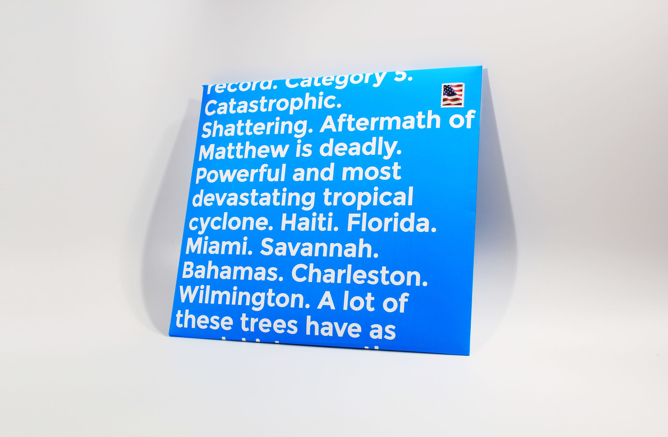
On October 7th, 2016, Savannah witnessed one of the deadliest natural disasters of its time – Hurricane Matthew.


“This is an unusual piece of art that is highly conceptual. We really hadn’t seen anything like this ever before”
Gordon Silveria
Director of Digital Arts EducationTechnology | Academy of Art University
Peacock
Identity Design and Branding
2020
Identity Design and Branding
2020

Chief Creative Officer - Beat Baudenbacher
Executive Creative Director - Daniel Doernemann
Executive Producer - Scott Lakso
Art Director - Pete Jeffs and Jim Read
Associate Producer - Sarah Keshishian
Designer - Chetan Singh Kunwar
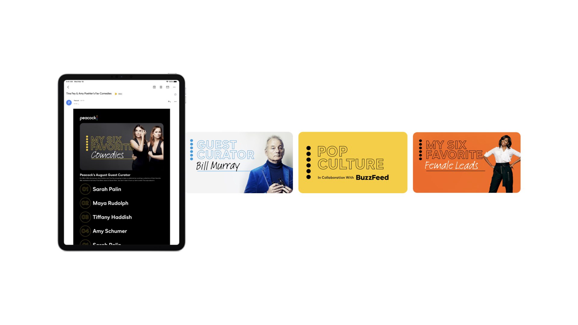
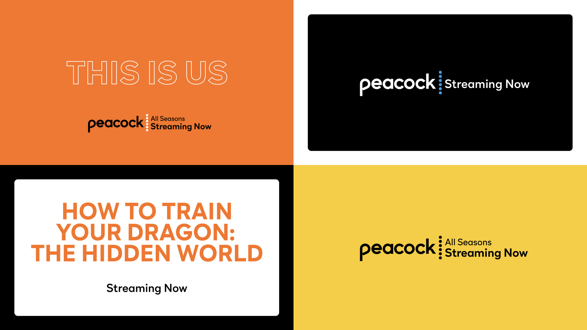
Peacock is a nod to NBC’s iconic logo and NBCUniversal’s rich legacy of creating beloved films, TV series, characters and franchises that have been at the epicenter of pop culture and will continue to define the future of entertainment.
NBCUniversal collaborated with the team here at Loyalkaspar to contrive, develop, and conceive the brand that is Peacock. The objective for the team was pretty straight forward - to celebrate NBCs rich history yet set itself apart and establish its own presence in the streaming market.
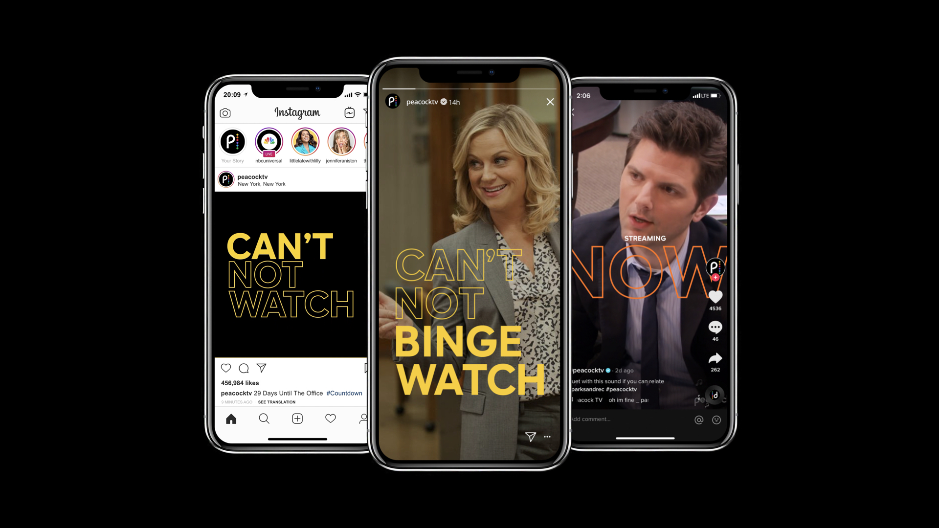
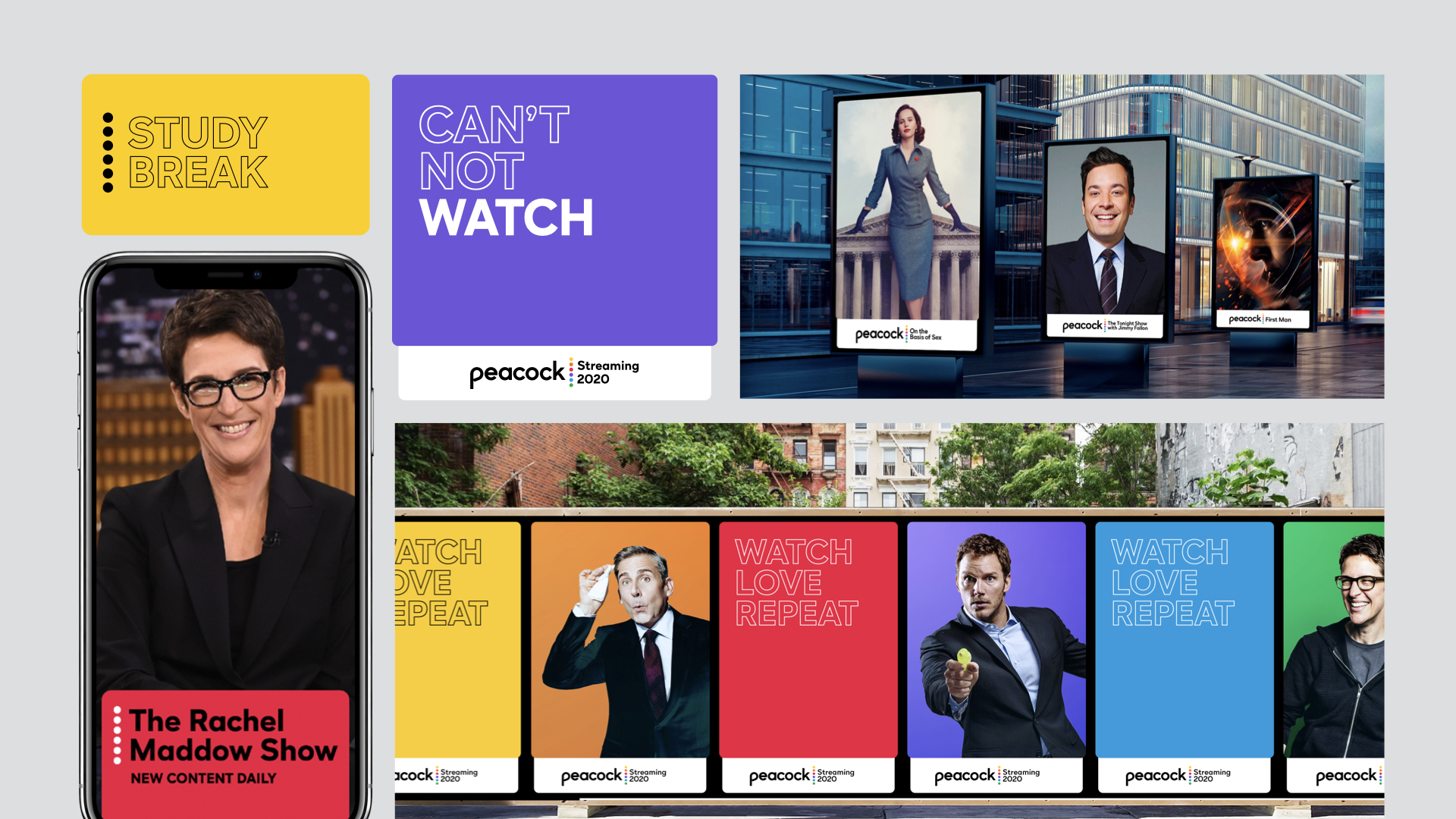
Our collaboration produced a rich and versatile design system that works across all platforms and sizes, from app buttons to large-scale billboards. Not only that, the design system extends to flexibe visual toolkits for original, promos, endpages, social and brand guidelines.
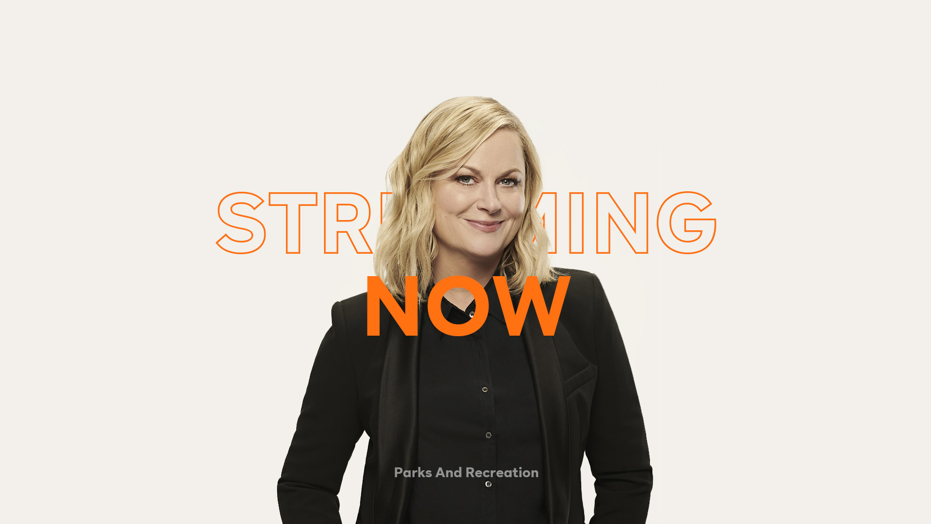
Streaming July 15, 2020


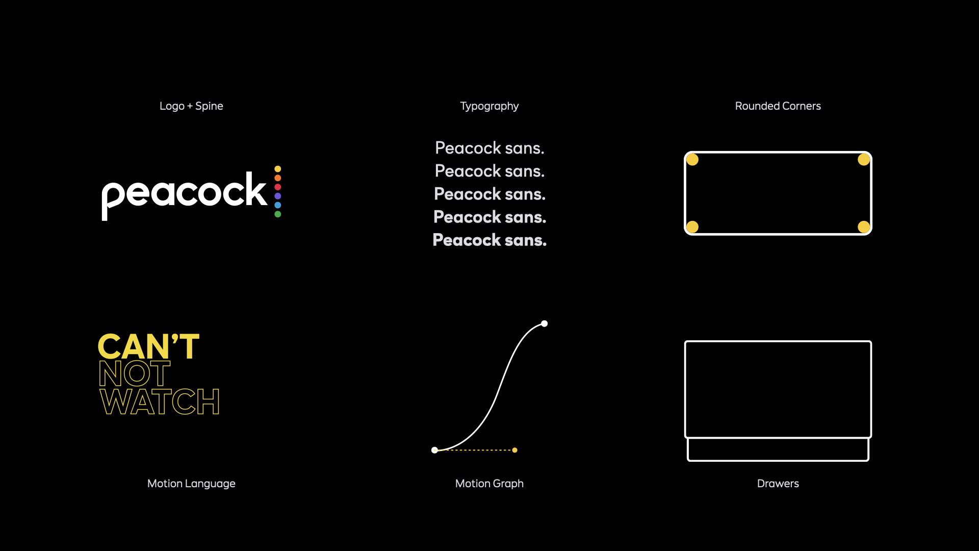
A logo that’s rooted deep into the spine
Our wordmark is bold, full of character, immersed in the legacy of NBCUniversal and brushed with a dash of flamboyance. The six colored circles of the ‘Spine’ synthesizes the NBC color palette, representing the full spectrum of content available across the platform for the viewers to relish.
‘Spine’ not only functions as a memorable mark but also allows the brand to use it as an anchor point for messaging and a placeholder for logomarks for future partnerships.
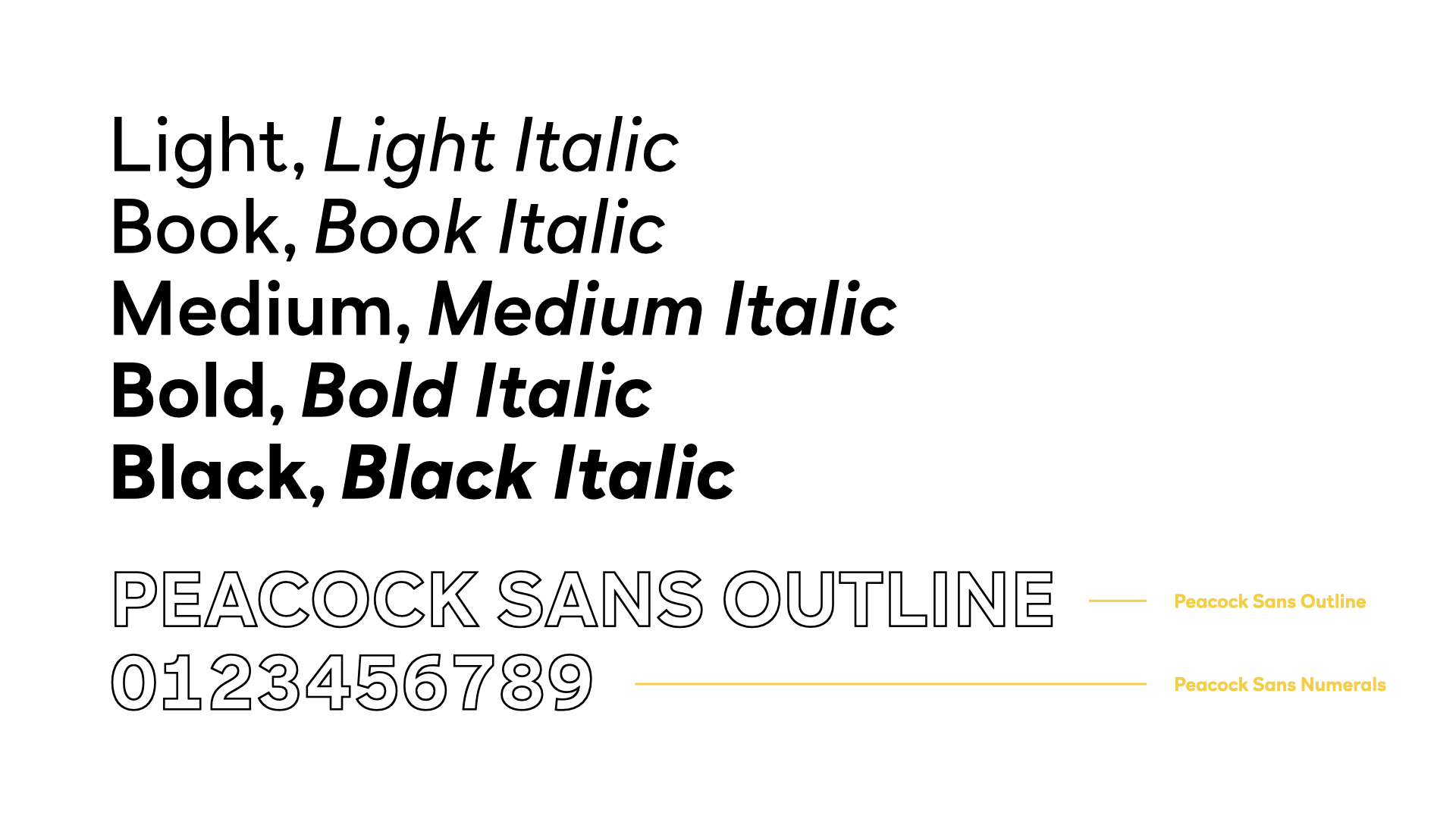

Peacock Sans
Peacock Sans is a geometric sans serif inspired by the circular motifs present throughout the brand. It’s edgy, modern and everything you need. Specially designed to be legible at small sizes across multiple devices, it is available in five weights in Roman and Italic.
Loyalkaspar also designed a bespoke outline version of Peacock Sans as a tool to add personality and ownability to the brand DNA.

Think of the peacock as “the most interesting bird in the world” - confident and cool, often surrounded by celebrity friends but never trying too hard to attract attention.
The peacock connects with talent and audiences because it has a proven track in entertainment - it effortlessly commands a room with its raw animal magnetism. The Peacock is like the Dalai Lama, but cooler - because it’s not a llama.
It’s a Peacock.
The peacock connects with talent and audiences because it has a proven track in entertainment - it effortlessly commands a room with its raw animal magnetism. The Peacock is like the Dalai Lama, but cooler - because it’s not a llama.
It’s a Peacock.
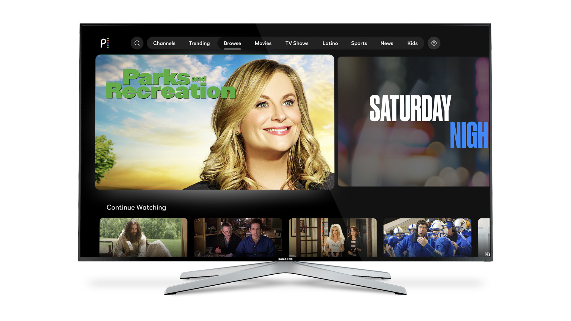
Peacock Originals
Peacock is set to deliver a world-class slate of originals while also offering treasured hits from the vaults of NBC. The service will also feature blockbusters and critically -acclaimed films from Universal Pictures, Focus Features, DreamWorks Animation, Illumination and Hollywood’s biggest studios.

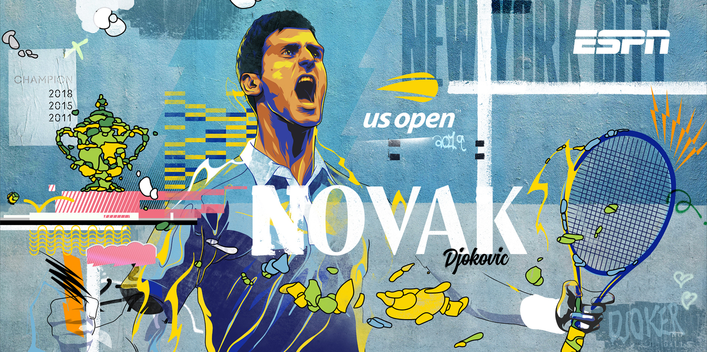
ESPN US Open Anthem
Mural Illustration
2019
Mural Illustration
2019
Executed with Loyalkaspar.
Aired in 2019.
To promote ESPN's US Open coverage, Loyalkaspar constructed 5 murals in Dumbo, Brooklyn, one of NYC's most scenic neighborhoods. Naturally, crowds of people showed up and had a blast posing with the murals, which made for amazing footage and lead to this anthem spot. The series consists of 5 different murals carrying illustrations for four renowned names - Serena Williams, Roger Federar, Novak Djokovic and Naomi Osaka along with a US Open branded mural.
Creative Direction : Beat BaudenBachar
Art Direction : Joe Fuller
Produced by : Tim Cella
Art Direction : Joe Fuller
Produced by : Tim Cella


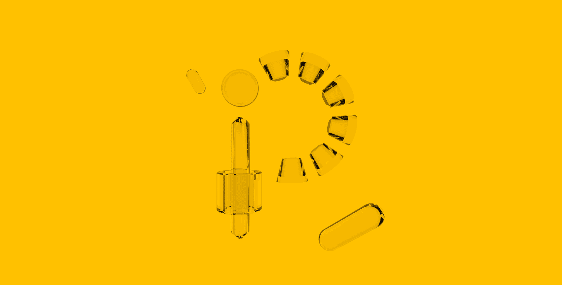
Portrait of a Type
Typography
2019
Typography
2019
36 days of type.
The series explores treating type as a real entity and diving deep into the subconscious of a select type. The series further uses glass in abstract shapes as a metaphor to dreams and how it converses with reality. It further messes with different surfaces and it renders a new portrait of type.


Every alphabet you see here is animated into a five second video using Cinema 4d and will be available for prints soon.
Meander
Experiential Design
2016
Experiential Design
2016
Meander and let it lead to places you’ve never been before.
Taking the idea from making something meaningful out of mundane, the project was inspired from a short hike I took back in India. It was the sense of perseverance and determination that drove me to complete that stretch. I was left with a profound feeling and wanted to channel the exact same feeling through this project. It concept began with the idea of being in a place full of nature yet not acknowledging what one is surrounded with. One of the core elements used in this project was a mirror as a tool to create a distraction and at the same time reflect an element from the surrounding which people tend to miss out. Multiple mirrors were setup in a location extremely famous in Savannah. The mirrors also carried a small typographic message persuading them to behave in a certain way. The last stage of the process had some pre–stamped postcards that they could send to their loved ones.
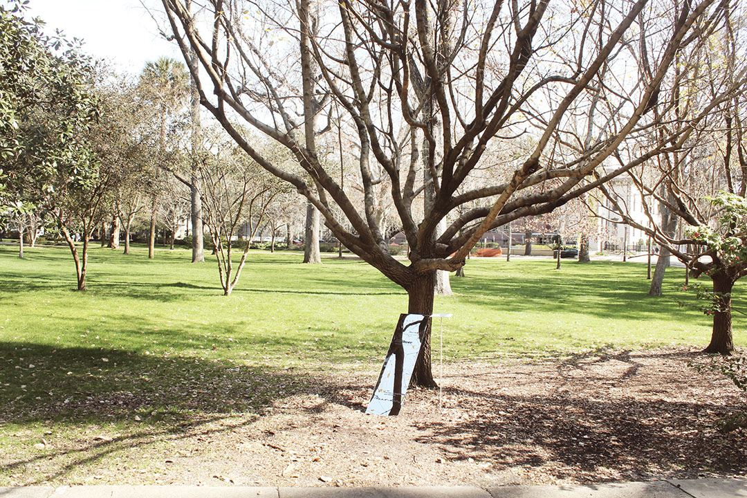
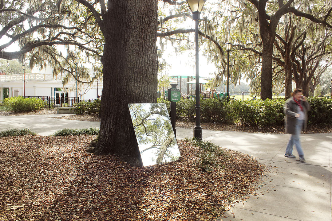
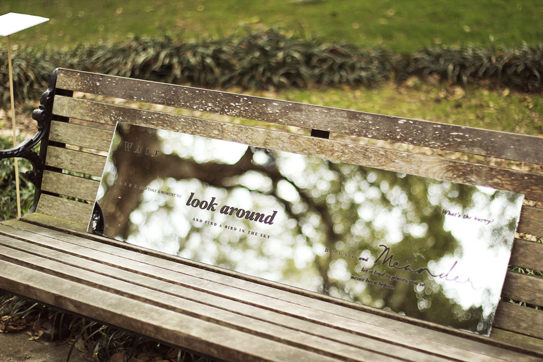
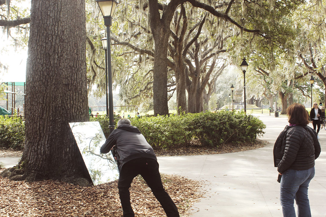
Amidst this complex and heavy lifestyle, we all seek a moment; moment away from the society, technology or just a moment of peace. Meander was created to reinforce the idea to step back and blink and come out of the social delusions that we’re attached to. It is a derivation of my personal experience and the profound feeling I was left with. It is a social experiment where mirrors with type were used as carriers to drive my audience to small snippets in nature.